Monday, May 30, 2016

All About You

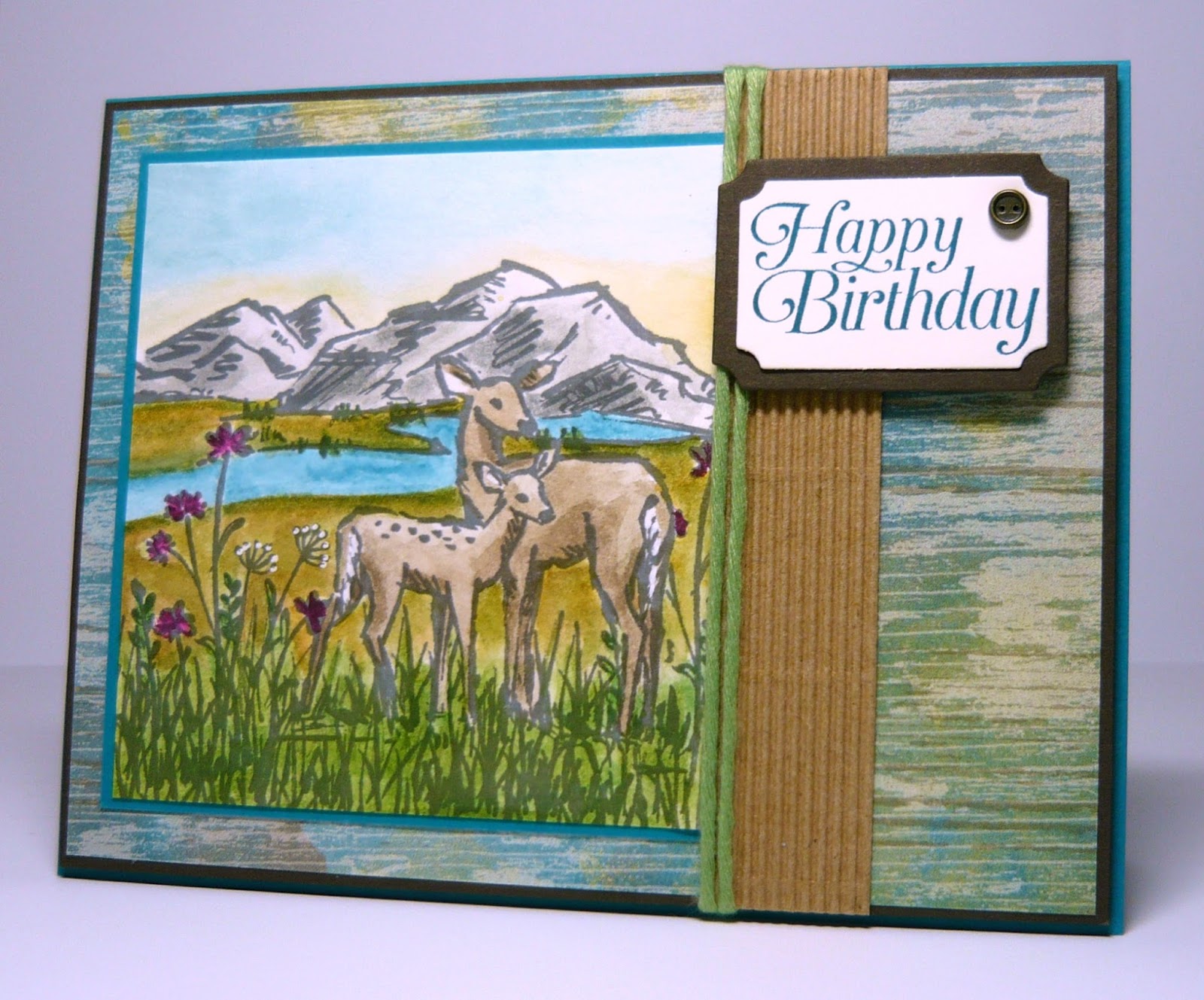
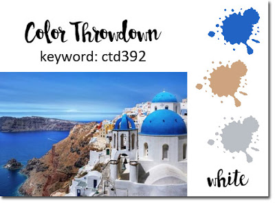
Welcome back!  It's Monday and time to share my sample for this week's Color Challenge at Splitcoaststampers.  This week Mary has chosen the rich color combination of Cherry Cobbler, Wild Wasabi and Gold.  "Dessert" is anything goes, so I chose ribbon.  I hope you'll be able to join us this week!


I use this week's sketch challenge at Global Design Project.

I was really leaning towards making a Christmas card with this week's colors but in the end, I decided to pull out my retired Blendability Markers and color a floral image.  I can tell I'm a bit out of practice - getting the change in values was a bit tricky, but overall I think they turned out pretty well.


After coloring the flowers the panel was trimmed down, then mounted on a slightly larger piece of Gold Foil card stock.  I flipped the sentiment to the top of the panel and added a bit of gold ribbon around the stems.  The gold polka dot vellum was adhered to a same size piece of Whisper White card stock using Glue Dots hiding behind some of the polka dots, then it was popped up on Dimensionals and layered on a Cherry Cobbler card stock base.


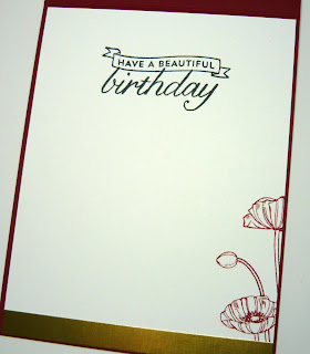
This card feels busy due to the vellum design but it really has few components and was easy to put together.  For the interior I added another sentiment stamp and a different part of the poppy stamp in Cherry Cobbler.


Thanks so much for taking the time to visit, and as always, I'd love to hear from you if you have a moment to leave a comment.  Be sure to use the links above to check out both challenges - lots of amazing inspiration in store for you!

Until next time...

Stef


Product details:
Stamps:  Pleasant Poppies, Birthday Blossoms
Paper:  Whisper White, Cherry Cobbler, Fancy Foil Designer Vellum, Gold Foil
Ink:  Memento Tuxedo Black
Other:  Cherry Cobbler and Wild Wasabi Blendability Markers, gold Wink of Stella, Gold 1/8" ribbon, Corner Rounder punch

Saturday, May 28, 2016

Morning Meadow

Hi there and welcome back!  Today I finished up a card made with this week's sketch at Mojo Monday.  I really like how it turned out so I think it may end up being for my husband's birthday in a couple of weeks.  He really likes the outdoor scenes, so I think he'd enjoy this card.  I'm also entering it in this week's challenge at Just Add Ink, where we are to "just add...B".  I'm hoping "birthday" qualifies for that category!


Other than the sentiment, the stamped images are all from the In the Meadow stamp set and were stamped in Archival Basic Gray on Shimmery White card stock.  I started by stamping the doe and fawn, then covered them with a mask cut from a post it note before adding the rest of the scene.  The grass and flowers created a knoll where the deer are standing, with the hill, water and meadow in the distance.  I then started water coloring with an Aqua Painter:  the deer with Crumb Cake ink, then the grass in Wild Wasabi and Garden Green ink.  I used Smoky Slate for the hills and Island Indigo for the lake and river.


Since I used my bright greens for the "knoll" I was a bit stumped at first as to how to color the meadow in the background, as I didn't want it to be brown, but if I used another green, then there would not be enough contrast against the grass in the foreground.  I came up with using the dark yellow, Delightful Dijon, which by itself was just too yellow, so a light coat of Soft Suede was applied, but that made it too brown.  Finally I added some Pear Pizzazz, and was happy with the result, especially after using a Blender Pen with the Pear ink to add darker green all along the water and the base of the far hill.


The next step was the sky.  I wanted it to look like the sun was just rising to the East, so I used So Saffron to add a glow above the mountains, with a bit darker yellow on the right end.  I let the yellow layer dry before adding some Soft Sky, so it didn't turn the yellow green where the two colors met, and made it darker on the left and gradually lightening on the right where the sun is rising.  After everything dried I took my Rich Razzleberry marker and added color to some of the flowers and a White gel pen for the tops of a couple of the other flowers, plus along the tail of both the deer.

Well, this is quite the long post for me, so I hope you made it through all the detail okay!  Here's the sketch and links to Mojo Monday (MOJO449) and Just Add Ink (JAI 313).  Do be sure to check out the amazing inspiration at both blogs!!


Thanks for looking and as always, your visit and comments are so appreciated!  

Until next time...

Stef


Product details:
Stamps:  In the Meadow, Sky's the Limit (sentiment)
Paper:  Very Vanilla, Shimmery White, Island Indigo, Early Espresso, Corrugated Kraft, Soho Subway designer series paper
Ink:  Archival Basic Gray, Smoky Slate, Soft Sky, So Saffron, Crumb Cake, Garden Green, Wild Wasabi, Pear Pizzazz, Soft Suede, Delightful Dijon, Rich Razzleberry, Island Indigo
Other:  Aqua Painter, Wild Wasabi Cotton Twine, White Signo Unibal Gel Pen, Vintage Trinkets

Friday, May 27, 2016

Sugarplum Birthday

Hello there!  I have a very quick post with my entry to The Paper Players, where they have a sketch challenge this week.  I'm scooting in just before the deadline.


I've combined some old (stamp set) with the new (card stock ans washi tape) to create this pretty little birthday card.  I have a co-worker that LOVES purple, so this will be for her birthday next week.  The card stock is in one of the new Stampin' Up! In Colors called Sweet Sugarplum, and I think it is beautiful.  The Playful Palette Designer Washi Tape incorporates 3 of the new In colors along with Blushing Bride and Basic Black, all available to purchase next Wednesday, June 1st.


The flower and background were colored using an Aqua Painter on Shimmery White card stock, layered on a Thick Whisper White base, then covered with the top layer that was cut with an Circles Collection framelit to exposure the flower beneath. Sequins and the sentiment were the finishing touches.  The Scallop Oval was punched from another new In Color called Peekaboo Peach - I love how nice it looks against the light purple.

Here's the sketch and a link to the challenge.  Be sure to check out all the amazing inspiration!


Thanks so much for the visit!

Until next time...

Stef


Product details
Stamps:  Simply Sketched
Paper:  Thick and Regular Whisper White, Shimmery White, Peekaboo Peach, Sweet Sugarplum
Ink:  Archival Basic Gray, Emerald Envy, Flirty Flamingo, Sweet Sugarplum, Soft Sky
Other:  Playful Palette Designer Washi Tape, Metallic Sequins, Circles Collection framelit, Rhinestone Basic Jewels, Large and Scallop oval punches

Thursday, May 26, 2016

Swallowtail Birthday

Hello again! I've made one more card for this week's Color Challenge at Splitcoaststampers, with the colors Crushed Curry, Pumpkin Pie and Watermelon Wonder (SCS CC584).  For "dessert", we could use our favorite color of green.  For this card I wanted to use the Swallowtail Butterfly stamp with those lovely colors.


I began by stamping the butterfly on a panel of water color paper, then used an Aqua Painter and reinkers in the challenge colors to color the butterfly.  After the butterfly dried (I used my heat tool to speed up that process), I colored the background in one of the new In Colors, Emerald Envy.  Now, this is a very bright and cool green, but with plenty of water from the Aqua Painter, it became a soothing, lovely light green.


You may have noticed that this butterfly was actually adhered to the background - if you did you'd be right.  On my first try, after the background dried I went in and added some spots and other textured background stamps in Crushed Curry, such as you see in the photos above.  But then I added some spots in black and it looked AWFUL!  Yikes!  So I ended up fussy cutting the butterfly, coloring another background on a water color paper panel, adding stamped texture ONLY in Crushed Curry, then layering on the butterfly image.  Much better

Lots of extra and unexpected work to get to this final version but I am very happy I stuck with it.  I really love the "cool: temperature" of the blue green background with all the warm colors used to color the butterfly and the yellow sentiment banner.

Thanks so much for visiting.  Be sure to use the link above to visit the SCS Color Challenge - great inspiration and no time limit to join in.

Until next time....

Stef


Product details
Stamps:  Swallowtail, Gorgeous Grunge, Butterfly Basics
Paper:  Basic Black, Crushed Curry, Watercolor
Ink:  Crushed Curry, Pumpkin Pie, Watermelon Wonder, Archival Basic Black, Emerald Envy
Other:  Banner Triple punch, Aqua Painter, Rhinestone Basic Jewels, Paper Snips

Monday, May 23, 2016

Sending Wishes

Hi there!  It's Monday evening and time for my sample for this week's Color Challenge at Splitcoaststampers. This week Maura has chosen the colors Watermelon Wonder, Pumpkin Pie and Crushed Curry.  Boy, those are some luscious colors together.  "Dessert" is to use one's favorite green, so I chose Mossy Meadow.  I've added a link below so you can check out all the fabulous inspiration and hopefully join us this week!


I wasn't sure just how I was going to use these colors until I finally decided they would look lovely as the sky just before sunrise or just after sunset (your choice).  I started with a panel of Whisper White, first sponging Crushed Curry in the middle third, adding the green at the bottom.  Next I started at the top with Watermelon Wonder, then blended Pumpkin Pie into the edges of both the watermelon and curry bands.  Lastly I edged the top of the green with a bit more Pumpkin Pie.


The silhouettes are from the World of Dreams stamp set.  The were inked up in Memento Tuxedo Black and layered at the bottom of the panel.  The same ink was used for the sentiment.  An Antique Brad with a pretty floral filigree look was then added to the corner.


The Mossy Green panel under the main image was stamped with a background stamp and wrapped with black striped ribbon before being mounted to a Mossy Green base, and having the top panel popped up with Dimensionals.


Thanks for visiting and as always, I would love to hear from you if you have time to leave a comment.  I hope you're able to join us at the SCS Color Challenge this week!

Until next time...

Stef


Product details
Stamps:  World of Dreams, Butterfly Basics
Paper:  Whisper White, Basic Black, Mossy Meadow
Ink:  Watermelon Wonder, Pumpkin Pie, Crushed Curry Mossy Meadow, Memento Tuxedo Black
Other:  Antique Brad, 1 1/4" Black Striped Grosgrain ribbon, sponges

Sunday, May 22, 2016

Loads of Thanks

Hello again!  Hope your day is going well.  Fab Friday has a great sketch for its current challenge, so I decided to play along.  I had colored this piece from You're Sublime as my sample for the current Color Challenge at Splitcoaststampers, but decided to use another image, so it made creating this card pretty quick.


Using Archival Basic Black, the image was stamped on watercolor paper, and with an Aqua Painter, applied Tempting Turquoise to the wheel barrow, Pear Pizzazz to the leaves and ground, and So Saffron and Melon Mambo to the flowers, really using just a little of the Melon Mambo to get the light pink color.  The white flower was colored with a Signo Uniball White Gel pen.


With the cheerful little wheel barrow filled with spring flowers, I thought some butterflies would be appropriate, so the Whisper White vertical panel was embossed with the Fluttering folder. The sketch calls for a little shape off the lower left of the circle but my little butterfly didn't look right there so I moved it to the upper part of the circle.  I don't use ribbon on my cards nearly as much as I did years ago, but I thought the So Saffron bow would add a nice feminine touch, so I used it in lieu of a banner as called for in the sketch.  The final bit was to add a couple buttons in the corner.

The sketch is below.  I've also added a link to Fab Friday so be sure to use it to check out all the wonderful inspiration!


Thanks for the visit, and as always, I'd love to hear from you if you have a moment to leave a comment!  I hope you have a great week ahead, and if you have a chance, swing back by tomorrow night when I'll be sharing my sample for this week's SCS color challenge.

Until next time...

Stef


Product details
Stamps:  You're Sublime
Paper:  Whisper White, Tempting Turquoise, Watercolor, Brights Designer Series Paper Stack
Ink:  Archival Basic Black, Tempting Turquoise, Melon Mambo, So Saffron, Smoky Slate, Pear Pizzazz, Soft Sky, Silver Encore
Other:  So Saffron Grosgrain ribbon, Circles Collection framelit, 2 1/2" Circle punch, Aqua Painter, Beautiful Wings embosslit folder, Brights Buttons, Whisper White Baker's Twine, Fluttering Texture Impression Embossing Folder, Signo Uniball White Gel Pen

Saturday, May 21, 2016

A Bermuda Pool Birthday

Hello again and welcome back!  Today I am sharing a card made with the sketch from Mojo Monday and using the Pals Paper Arts color challenge colors of Bermuda Bay, Pool Party and Crushed Curry.  Woo hoo, do I love those colors together!


I decided to use the cute Balloon Celebration stamp set for this card.  It's a fun, festive set that I think works well with these two challenges.


The Pool Party base was stamped in Versamark ink using a couple of the fun circle/swirly background stamps from the set. The Bermuda Bay and Whisper White squares were cut with new Layering Squares framelits available June 1st in the new Stampin' Up! catalogue.  The white square was stamped a couple of times with the cloud stamp that had been inked up with Pool Party and stamped off before stamping the panel.


The lovely part of photopolymer stamps is that you can see where you're stamping, so for the sentiment I was able to layer Happy Birthday to fit in the 1 3/8" Circle punch, which was then layered onto a Crushed Curry Scallop circle.  In order to make the layout work with the balloons, I switched sides for placement of the circle.

Thanks for your visit today, and as always, I'd love to hear from you if you have a moment to leave a comment!  I've added links above to the respective challenges, so I encourage you to use them and check out all the fabulous inspiration!

Until next time....

Stef


Product details
Stamps:  Balloon Celebration
Paper:  Whisper White, Pool Party, Crushed Curry, Bermuda Bay
Ink:  Versamark, Pool Party
Other:  Balloon Bouquet punch, Layering Squares framelits, Scallop Circle and 1 3/8" Circle punches, Crushed Curry Baker's Twine, Brights Candy Dot, Crushed Curry Stampin' Emboss powder

Thursday, May 19, 2016

Froggy Hello

Hi there!  For this post I have a card to share that I made for this week's challenge at The Paper Players, where LeAnne has asked us to make a CAS card featuring a wild animal.  Well, how about a wild amphibian?


The first thing I thought of was one of my favorite stamps, the frog from You're Sublime.  It's just so darn cute!!  I found that I had one unused from a previous project that was already colored with Blendability markers and was fussy cut as well, so this card came together fairly quickly, after getting the sentiment in place.


I started with a panel of Whisper White, stamped the grass and "dirt" then cut the sentiment with a Hello You framelit.  It was cut both from the panel and a piece of Delightful Dijon, which was then layered inside the negative space of the panel.


After adhering the fussy cut frog and adding some clear sequins, the panel was mounted with Dimensionals on a base of Thick Whisper White card stock.  I have to say this is one of the most CAS cards I've ever made and it was fun to come up with an idea and quickly complete it.  Of course, having the previously colored and fussy cut frog helped!

Thanks for dropping by and as always, your visit and comments are so appreciated!  Don't forget to use the link above to check out all the wonderful inspiration!

Until next time...

Stef


Product details:
Stamps:  You're Sublime
Paper:  Thick and Regular Whisper White, Delightful Dijon
Ink:  Delightful Dijon, Sahara Sand
Other:  Old Olive Blendability Markers, Metallic Sequins, Hello You framelits

Monday, May 16, 2016

Dots & Scallops

Hello again!  It's Monday night and time to post my sample for this week's Color Challenge at Splitcoaststampers, where Barbara has picked the lovely and bright combination of Tempting Turquoise, Melon Mambo and So Saffron.  I used the wonderful sketch from this week's challenge at Pals Paper Arts.  Links to both challenges below.


"Dessert" for this week's color challenge is water coloring.  I looked for a floral stamp set that had a couple different flowers in order to use both Melon Mambo and So Saffron ink, and decided to use a stamp from I Like You, a retired Host stamp set from a couple of years ago.


After water coloring, the panel was mounted on a square cut with a new Layering Squares framelit that will be available in the upcoming Stampin' Up! catalogue on June 1st.  Love those little scallops!


I tried to use a sentiment heat embossed on a vellum banner so it could lay across the top of the water colored images but it just didn't pop well enough.  So instead I put a Melon Mambo banner underneath the square and added the sentiment from Circle of Spring to the lower right corner.


For the base I used Thick Whisper White card stock.  Before adding the square panel, the base was topped with the cute polka dot pattern dsp from the Brights Designer Series Paper Stack.  The final touch was to add Melon Mambo Candy Dots and White Enamel Dots.

Thanks for coming by!  As always your visit and comments are so appreciated.  Be sure to use the links above to check out all the wonderful inspiration.

Until next time...

Stef


Product details
Stamps:  I Like You, Circle of Spring
Paper:  Thick Whisper White, Tempting Turquoise, Melon Mambo, Watercolor, Brights Designer Series Paper Stack
Ink:  Jet Black Stazon, Melon Mambo, So Saffron, Tempting Turquoise, Pear Pizzazz
Other:  Layering Squares framelit, 7/8" and 1 1/4" Scallop Circle punches, Aqua Painter, White Enamel Dots, Brights Candy Dots

Friday, May 13, 2016

Pacific Birthday Greetings

Hi there!  Hope you're having a good day!  I took a vacation day today and got to do a couple things I really enjoy - going for a long walk around the nearby Wildlife Reserve with my husband, and then spending some time in my craft room!  The resulting card from time spent in the craft room was made for two challenges using the fun sketch at Mojo Monday and luscious colors at Color Throwdown.


We're coming up to the heavy family birthday season (13 birthdays between mid June and mid August) and I especially need masculine birthday cards.  I felt the sketch and colors offered the perfect opportunity to get one made.


Starting with the Smoky Slate base, I used stamps from Timeless Textures to add a bit of collage design, then added circles cut from Corrugated Kraft card stock.  Next I found a perfect square of Textured Pacific Point card stock in my scraps that seemed to match up with the bright dark blue of the color challenge.  Once that was layered on the card I added a horizontal piece of embossed smoky slate and the Linen Thread


For the main image, the birds were stamped in Archival Basic Gray so I could water color around them.  Starting with the "sand", I used my Aqua Painter to lay down some water, then dipped the painter into some Crumb Cake ink and colored the sand, making sure to leave the birds wading in the water.  Same step with Pacific Point ink, moving it in and around the birds.  Finally, true to the coast off Oregon, I added Smoky Slate to create a bit of a foggy, cloudy sky.  After the initial water coloring, I went back over certain areas to create variations in the color, and after everything dried, used a White Signo Uniball pen to create the look of the sea foam and tops of waves.  The final step was to mount it on a Kraft panel and pop it up on the card with Dimensionals.

Thanks for visiting!  Be sure to use the links above to check out all the amazing inspiration.

Until next time...

Stef


Product details
Stamps:  Wetlands, Timeless Texture
Paper:  Smoky Slate, Textured Pacific Point, Kraft, Watercolor, Corrugated Kraft
Ink:  Pacific Point, Smoky Slate, Crumb Cake, Versamark, Archival Basic Gray
Other:  Woodgrain Textured Impression Embossing Folder, Aqua Painter, White Signo Uniball pen, Linen Thread

Tuesday, May 10, 2016

Kindness

Hi there!  The current challenge at Just Add Ink (link here JAI 310) is this awesome sketch, so I made time this weekend to create a fun and quick card.


I received my Stampin' Up pre-order for the upcoming new catalogue available June 1st and wanted to use Dapper Denim, one of the fabulous new In Colors.  It was fun trying to match it up with current colors.  I ended up using Calypso Coral, Crushed Curry and Smoky Slate for this card.


Once I settled on the stamp set to use, the card came together relatively quickly.  When I first saw the sketch with the circle divided by a banner, the sun from Kinda Eclectic immediately came to mind.  I cut two circles, one in Whisper White, the other in Smoky Slate (which was then cut in half), stamped the circles with their respective stamps, then adhered the gray half circle and blue banner onto the white circle.


The Dapper Denim base is 4.25 square and was topped with a slightly smaller panel of embossed Calypso Coral.  After the circle was layered on top, the butterfly and buttons were added to finish it off.

Thanks for visiting today!  Be sure to use the link above to check out all the amazing inspiration from the JAI design team!

Until next time...

Stef


Product details
Stamps;  Kinda Eclectic
Paper:  Whisper White, Smoky Slate, Calypso Coral, Dapper Denim
Ink:  Crushed Curry, Calypso Coral
Other:  Circles Collection framelit, Brick Wall Textured Impression Embossing Folder, Calypso Coral Baker's Twine, Bitty Butterfly punch, Pearl Basic Jewels.

Monday, May 9, 2016

Bloom

Hi there and welcome back!  It's Monday evening and time to share my sample for this week's Color Challenge at Splitcoaststampers.  I've also used the fabulous current sketch from CAS(E) this sketch for my layout.

This week Peggy has chosen the colors Real Red, Garden Green  Cucumber Crush and Sahara Sand, and "dessert" is "Let's have a picnic!".  I don't know if my card technically qualifies for dessert, but if you have flowers at a picnic, then I'm in!
ETA:  I've used the wrong green this week, should be Cucumber Crush.  Ah well, better pay closer attention to the list next week LOL!


The Impression Obsession stamp I used to create my card was an impulse buy at the LSS.  I loved the cute line art drawing of cone flowers and the hand drawn frame.  I thought it would work perfectly in the corner for the sketch.


I stamped it in Archival Basic Black on watercolor paper, used an Aqua Painter and reinkers to color with the challenge colors.  The flowers had little black dots on the cone part, so after it dried from watercoloring, I used a White Signo gel pen to color the dots white, plus fill in between the black parts of the frame.  Lastly, I trimmed it with my paper snips to mount on the card base.

Stripes and splatter dots were stamped in the lower right corner of the Thick Whisper White base, then gold thread attached before adding the water colored square.  Okay, I think I got a little carried away with the gold thread but it was fun trying to make all the circles and shape it to fit under the little square.  ;-)


Thanks for taking time to drop by - your visit and comments are always so appreciated.  Do be sure to use the links above to check out the great challenges and beautiful inspiration!

Until next time....

Stef


Product details
Stamps:  Bloom (Impression Obsession), Gorgeous Grunge, Timeless Textures
Paper:  Thick Whisper White, Watercolor
Ink:  Archival Basic Black, Real Red, Sahara Sand, Garden Green
Other:  White Signo Uniball, Gold Metallic Thread, Aqua Painter

Sunday, May 8, 2016

Remarkable Birthday

Hi again!  I hope you're having a great day!  Yup, I'm back with a second post today.  For this one, I have a card made for the current color challenge at Fab Friday, using Soft Sky, Lost Lagoon, Hello Honey and Crumb Cake.  Love this mix!  I also used a prior sketch from Freshly Made Sketches for my layout (FMS234).


I started by doing a Soft Sky color wash with an Aqua Painter on a panel of water color paper.  When that was dry I stamped the flower in Archival Basic Black then colored the petals in Lost Lagoon and the stem in Crumb Cake.  When dry, it was masked off so the honeycomb image could be stamped in Hello Honey on the right edge.  Finally, the sentiment was inked up in Lost Lagoon.


A strip of designer series paper and the watercolor panel were layered on a slightly larger piece of Soft Sky, wrapped with a piece of Gold Cording Trim, then attached to the Crumb Cake Base.  It seemed to lack that last bit of "umph", so I colored the flower stamens with Gold Wink of Stella, then added splatter spots in Encore Gold on each side of the flower.


Thanks for taking a look!  If you're a mom, I hope you're having a wonderful Mother's Day!  As always, your visit and comments are so appreciated.  For some great inspiration, be sure to use the link above to visit Fab Friday.

Until next time....

Hugs,

Stef


Product details
Stamps:  Remarkable You, Butterfly Basics, Awesomely Artistic
Paper:  Crumb Cake, Soft Sky, Watercolor, Love Blossoms designer series paper stack
Ink:  Archival Basic Black, Soft Sky Lost Lagoon, Hello Honey, Crumb Cake, Encore Gold
Other:  Aqua Painter, Gold Wink of Stella, Gold Cording Trim

Hello, Dahlia

Hi again!  I hope you're having a great weekend, and if you're a mom, a Happy Mother's Day to you!  Today I'm sharing a card I made for this week's sketch challenge at Global Design Project.  Here's a link to the challenge site #GDP034 - be sure to use to it check out all the fabulous inspiration.


Late this week I received my pre-order for the new Stampin' Up! catalogue (available to everyone June 1) and was able to incorporate a couple of the new 2016-2018 In Colors in my card. I think Stampin' Up! really hit a home run with these new colors!


I started by inking up the Definitely Dahlia stamp in Sweet Sugarplum (swooning over this new color), then spritzed it with a wee bit of water before stamping on the Whisper White panel.  After it dried, a strip of the new Playful Palette Designer Washi Tape was added to the bottom of the panel, which was then mounted on a slightly larger piece of the new Peekaboo Peach.  The washi tape includes the two new colors of Sweet Sugarplum and Peekaboo Peach, along with a very bright and beautiful green called Emerald Envy, plus current colors Blushing Bride and Basic Black.


Next I added the sentiment cut from Basic Black card stock with a Hello You Thinlit and a Blushing Bride butterfly cut with a Bold Butterfly Thinlit then brushed with a coat of Clear Wink of Stella.  Black sequins were added around the card and on the butterfly, then the entire thing popped up on Dimensionals on the Basic Black card stock base.

That's it for now.  I thank you for looking and of course would love to hear from you if have a moment to leave a comment!  Until next time...


Hugs,

Stef


Product detail
Stamps:  Definitely Dahlia
Paper:  Whisper White, Peekaboo Peach, Blushing Bride, Basic Black
Ink:  Sweet Sugarplum
Other:  Hello You Thinlit, Bold Butterfly Framelit,, Playful Palette Designer Washi Tape, Clear Wink of Stella, Metallic Sequins, Stampin' Spritzer