Saturday, March 30, 2013

A Vintage Secret Garden

When I saw the SU Spring Catalogue with the Secret Garden stamp set and matching dies, I swore to myself I was not going to get enamored with them (I love dies that match stamp sets...while I can do a mean fussy cut when necessary, dies save time and my poor eyes too!).  I mean, how many floral sets does one stamper "need".  ; - )  But, I was worn down by all the beautiful images I saw out there on the web...yes, you know who you are, you enablers with your gorgeous cards and stunning floral images!!  

Okay, so in a weak moment, I took the plunge,  Here is my first card with that stamp set:


Love, love, love those lined images.  While today I used them more as part of a collage with the stamped leaves and just a light color wash of Wisteria Wonder, I look forward to truly water coloring them with more depth of color.  The leaves look rather faint due to stamping on watercolor paper, which adds to the collage effect.


The card today uses this week's wonderful sketch at Freshly Made Sketches:


It is also for the weekly color challenge at Colourq Tuesday:


They always have lovely color challenges at cQc but it has never worked out for me to join the challenge.  However, this week I had begun building my card for the FMS sketch challenge in a monochromatic palate of Pool Party, so it was relatively easy to incorporate the remainder of the colors.

Finally, I'm entering this is the SU Only Challenge blog (suochallenges.com) where the theme is to make a spring card.  I guess this is a spring-y birthday card!


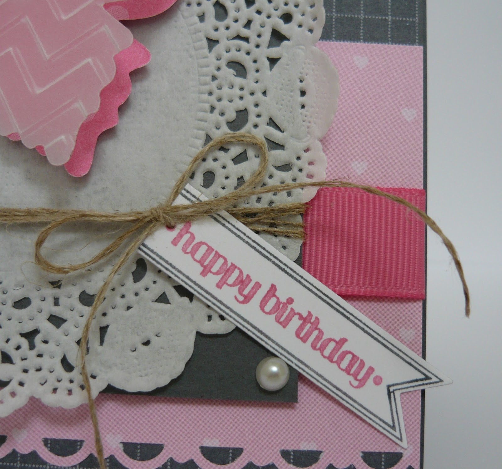
The sentiment was stamped in Versamark, heat embossed with white embossing powder and cut out with a Windows Collection framelit.  I love the intricate detail of this stamp.

Thank you so much for visiting today.  I'd love to hear from you if you have a moment to leave a comment!

Hugs,

Stef

All products Stampin' Up:
Stamps:  Secret Garden, Vintage Verses
Paper:  Whisper White, SU Watercolor paper, Pool Party card stock and Coordinations
Ink:  Always Artichoke, Lucky Limeade, Wisteria Wonder, Versamark, Jet Black Stazon
Accessories:  Aquapainter, SU white embossing powder, Windows Collection Framelit, Honeycomb ef, Wisteria Wonder Ruffled ribbon, Large Scallop Edgelit, Delicate Designs ef, White Baker's Twine. 


Thursday, March 28, 2013

A Vintage Daydream

Welcome and happy Thursday!  Today I have a card using the sketch challenge at Pals Paper Arts.  Although I missed the cut off for the challenge by a couple of hours (oops), I thought I would still share with you.

I started with Pool Party card stock, which was topped with Everyday Enchantment designer paper that had been adhered to a just slightly larger piece of Soft Suede.  The flagged pieces were cut from Peach Parfait card stock and stamped with Distress Dots in Versamark.


I stamped a sentiment from Vintage Versus inside a medallion from Daydream Medallion.  The medallion was stamped in Peach Parfait, with the sentiment in Pool Party.  Two Flower Trim roses are attached with pearls popped in the inside of the flower.


I popped the medallion onto a square of Pool Party Coordinations paper that had been embossed with the Fancy Fan folder.  Pool Party Seam Binding tape ribbon was the final touch. Pretty simple and easy.


Thanks again for coming by and taking a look.  It would be great if you'd take a moment and leave me a comment...I'd love to hear from you!

Hugs,

Stef

All products from Stampin' Up:
Stamps:  Vintage Verses, Distressed Dots, Daydream Medallions
Paper:  Pool Party, Soft Suede, Peach Parfait, Very Vanilla, Everyday Enchantment dp
Ink:  Peach Parfait, Pool Party, Versamark
Accessories:  Floral Frames Framelit, Pool Party Seam Binding tape, Flower Trim, Basic Pearls, Fancy Frame embossing folder, Stampamajig


Wednesday, March 27, 2013

The Best Things in Life

Hello again, friends!  My post today is a card for the Paper Players, where this week they have another great sketch.


I chose to use a new stamp set, The Best of Flowers, for this card.  While I love all the images, I thought the daisy would work best for what I had in mind:


The flower was stamped onto SU watercolor paper with Jet Black Stazon ink, then water colored with an Aquapainter, using Calypso Coral, Poppy Parade and So Saffron.  I then fussy cut it and popped it up on a medallion from Daydream Medallions that was cut with the matching framelit.  It reminds me of a Gerber Daisy, with their vibrant colors that last all summer long (under the loving care of my DH - I am the "black thumb" in our family LOL!  I can color them, I just can't keep the real ones alive.)


The sentiment is one of my favorites ever.  It just makes me happy.  I must confess, I have not read Ralph Waldo Emerson since high school (which was a long, long time ago-let's not go there!) so I don't know or remember the context in which this line was written, but one can't help but think it is urging the reader to live a robust, happy life.  


A Peach Parfait butterfly left over from another project finishes off my card up in the top left corner.


Well, that's it for today.  Now for some preparation for the two youngest grand kids, who will be visiting tomorrow and Friday.  They are old enough, at 7 and 11 years of age, to be pretty self sufficient, but they keep me busy...and young at heart!

Thank you for taking a look, and if you have a moment, please leave a comment, I'd love to hear from you.

Hugs,

Stef


All products from Stampin' Up:
Stamps:  The Best of Flowers, Daydream Medallions, Pursuit of Happiness
Paper:  Very Vanilla, Pool Party, Peach Parfait, Calyso Coral, Lucky Limeade, Everyday Enchantment dp, Watercolor
Ink:  Poppy Parade, So Saffron, Calypso Coral, Lucky Limeade, Jet Black Stazon
Accessories:  Floral Frames Framelit, Bird Builder punch, Scallop Oval punch, Scallop Edge Border punch, Fancy Fan ef, Calypso Coral ribbon, Naturals Designer button, Linen Thread, Beautiful Wings embosslit, Basic Pearls, Paper Snips, Aquapainter.


Sunday, March 24, 2013

A Regal Butterfly Birthday

Hello again!  Today's card was made for two challenges:  The Sweet Sunday Sketch Challenge and the Dynamic Duos color challenge.  Karen Giron created this super sketch for us to play with:


And the team at Dynamic Duos chose a pink monochromatic theme for this week's challenge:


I chose Basic Gray as my neutral, which looks lovely with these pinks.  I rounded up some retired SU paper pads that provided the designer paper.


I love the effect of the vellum over the designer paper, so I decided to try it for this sketch.  Regal Rose polka dotted paper lies underneath the vellum, which was embossed with the Chevron embossing folder and then decorated with a row of pearls.


A disclaimer about the photos:  I was trying to find places in my home to photograph with natural light, as I have not been happy with how dark my photos can be at times.  So you will see the background in this photo is different from the others.  The best light ended up being on the stairs in our entry, which has tons of windows, many north facing.


The sentiment is from Itty Bitty Banners and was cut out with the matching framelit.  You can see the sweet little hearts on the dp; perfect for this very girly card.  I carried that theme to the element in the upper left with a scallop circle punched piece of the same paper and a heart shaped bitty button.


Thank you for looking and I hope you'll take a moment to leave me a comment.  I love hearing from you!


All products from Stampin' Up:
Stamps:  Itty Bitty Banners
Paper:  Basic Gray, Whisper White, Pattern Pack dp, Good Neighbor dp, vellum card stock
Ink:  Basic Gray, Regal Rose
Accessories:  Beautiful Butterflies Bigz die, Bitty Banners Framelit, Bitty Button, Scallop Trim Border punch, Regal Rose grosgrain ribbon, Linen Thread, Basic Pearls, Beautiful Wings Embosslit, Paper Doily, Chevron embossing folder, 7/8" Scallop Circle punch


Delicate Details

My card today is based on the weekly Deconstructed Sketch #94:


I love the space in the cross piece, I think it's a clever way to add more interest to the card.  I followed the sketch pretty closely, rounding the corners and typing a bow at the intersection.


The sweet little flower and the wonderful wrinkled ribbon are both from Sharon Johnsons' Stamp Simply Ribbon Store (here's the link to her blog, you can access the ribbon store with a link at the top of her blog page http://notimetostamp.blogs.splitcoaststampers.com/).  If you love ribbon and flowers, you need to check out her store!  I don't remember the ribbon manufacturer, but the flower is from Maya Road.  Since it is an antique white color, I sponged some Blushing Bride ink on the edges to have it better match the paper.

The designer paper I used is "A Ladies Diary" from Graphic 45.  The vintage floral images and colors are exquisite.  I started with a base of Crumb Cake, then attached the dp to a slightly larger piece of Very Vanilla.


I was trying to decide what color to use for the polka dot sentiment frame.  Really Rust (retired SU) matches up well with this paper but got lost when placed up against the damask design on the cross piece, as the colors are too similar.  I had to get more venturesome, so I wandered out of my comfort zone a bit and decided to try Garden Green.  I was pleasantly surprised that it matches perfectly the green stems in the printed paper and rather brightens up the card.

  
I punched out the Really Rust sentiment portion with a Large Oval punch and popped it up on Dimensionals.  It looks a little crooked in the picture, but that has more to do with my photography skills ( or lack of LOL!) than anything.  IRL it looks straight.

I just hand cut the cute little flags.  All the edges were distressed and sponged with Tea Dye and Vintage Photo Distress ink.

Thanks for coming by today, I really appreciate that you took the time to take a look!  It would be great if you would leave a comment and say "Hi!"

I'll be back with another post either tonight or tomorrow.  Hope the upcoming week treats you great!!

Hugs,

Stef

All products by Stampin' Up unless otherwise noted:
Stamps:  Layered Labels
Paper:  Crumb Cake, Very Vanilla, A Ladies Diary (G45)
Ink:  Garden Green, Really Rust, Blushing Bride, Tea Dye and Vintage Photo Distress Ink (Ranger)
Accessories:  May Road Vintage Trinkets (flower), Wrinkled Ribbon, Basic Pearls, Apothecary Accents Framelit, Large Oval punch. 


Thursday, March 21, 2013

A Cup of Thanks

Hello again, hope your week is going well!  As I sit here writing this, outside the frogs are croaking at the top of their lungs, and earlier today, Spring really showed its arrival with on again, off again sunshine and dumping rain showers.  I'm really looking forward to the warmer weather, but not as much as friends in the Northeast...my goodness, it seems they are going to be buried in snow until June!

I'm very grateful for our temperate weather here in the Northwest US, so I guess sharing a thank you card on this post is appropriate!


The card today is for the wonderful sketch challenge over at Paper Players.  Here is the link:  (http://thepaperplayers.blogspot.com/) and here is the sketch:


I love this sketch; it has so many possibilities.  I decided to use a stamp set I have not used too often, Tea Shoppe.  I've used the big tea cup from the set a few times but never the little cups, so I thought it would be fun to cut them out and use on top of some punched layers.

Originally I was trying to work in a layer of Old Olive underneath the cups but it just didn't look right, so I ended up using a Very Vanilla doily punched out with the Doily Triple Layer punch, topped by a small Scallop Circle punch of Wisteria Wonder.


A stamp from French Foliage was inked in Wisteria Wonder, stamped off once and then stamped onto the scallop circles.  I cut the tea cups out with my paper snips and popped them up on dimensionals.

I stamped the flower from the Tea Shoppe set in Jet Black Stazon and the used a Blender pen and ink to color it.  After that, it was cut out with my paper snips (ooo, was that a delicate process with those skinny little stems!)

It's such a beautiful little flower, I really wanted it to highlight the sentiment, which was cut out with the Word Window punch.  A row of Basic Pearls added emphasis underneath.


I tried different ribbons, lace, etc. at the top, but in the end the Wisteria Wonder ruffled ribbon seemed to work the best.  A cute little button and some Linen Thread finished it off.


Thanks for dropping by today, I'd love to hear from you if you have time to leave a comment!

Hugs,

Stef


All products by Stampin' Up unless otherwise noted:
Stamps:  Tea Shoppe, French Foliage
Paper:  Whisper White, Very Vanilla, Elegant Eggplant, Wisteria Wonder card stock and In Color Paper Pack dp
Ink:  Elegant Eggplant, Wisteria Wonder, Old Olive, Stazon Jet Black
Accessories:  Wisteria Wonder Ruffled Ribbon, Regals button, Linen Thread, Doily Triple Layer, Word Window and 1 1/4" Scallop Circle punches, Blender pen, Paper Snips.


Monday, March 18, 2013

Embossed Bunny Ears

Hello again, hope you are having a great day!  I have a fun Easter card to share with you that I made with the Ears to You stamp.


I think these bunny images are so adorable, and of course the sentiment is very fun.  I pulled out some retired Afternoon Tea designer paper for less traditional Easter colors.  The bunnies were stamped in Whisper White Craft ink on Pool Party card stock, then heat embossed with white embossing powder.


The embossed image was then cut out with a Spellbinders Classic Circle die and backed with Whisper White die cut with Spellbinders Petite Scallop Circle die.  Delicate Details Lacy Tape and some Wild Wasabi striped grosgrain ribbon then divide the card.

In order to have it fit in the Ribbon Banner die, I bent the sentiment a bit when I attached it to the acrylic block.  However, I had to reink and stamp a second time to get a good image and by then the sentiment had "unbent" a bit.  It's a little hard to tell from the photo but it looks a little rounded in real life.  After the sentiment was die cut, I left the die on and lightly sponged Pool Party ink on the visible card stock, leaving a nice white border when the die is removed.


Buttons in the corner finished off the card.

Thanks for looking today.  I'd love to hear from you so I hope you'll take a moment to leave a comment!

Hugs,

Stef


All products from Stampin' Up unless otherwise noted:
Stamps:  Ears to You
Paper:  Whisper White, Pool Party, Afternoon Tea designer paper
Ink:  Pool Party, Calypso Coral, Whisper White Craft ink
Accessories:  White embossing powder, Delicate Details Lace Tape, Wasabi Striped Grosgrain ribbon, Artisan Embellishment Kit (button), SU and other buttons, Basic Pearls, Classic Circle, Petite Scallop Circle and ribbon Banner dies (Spellbinders), White Baker's Twine, Linen Thread. 


Sunday, March 17, 2013

A Paisley Birthday

Hello again!  Hope you are enjoying your St. Patrick's Day.  My husband and I will be celebrating at dinner with some traditional food associated with the holiday, but no green beer for us today!

My card is for a co-worker's birthday tomorrow.  It's being submitted for this week's challenge at Seize the Birthday, which is to use the sketch below to make a masculine card birthday card.


I haven't used much of the Print Poetry designer paper that is in Stampin' Up's spring catalogue, so I decided to use the Midnight Muse paisley print for this card.  Both the color and paisley design shouted "male card" to me!


I started with a Summer Starfruit card base, then adhered the paisley dp along with a strip of Midnight Muse embossed with the Chevron folder.  I stamped the label from Memorable Moments, cut it out and popped it up on Midnight Muse that was cut out with a Labels Collection framelit.


A 3/4" circle punch popped out the numbers, which were then mounted on that cute, cute, cute Petite Curly Label punch.  I hadn't used it until making this card and think the size is just adorable.  The "rd" was punched out with the Tiny Tag punch, with the narrow end snipped off.

Brads in two corners and some hemp twine were the finishing touches for this card.  Keeping it simple for a masculine look.

Thank you looking and I hope you'll take a moment to leave me a comment.  I enjoy hearing from you!

Hugs,

Stef


All Products from Stampin' Up unless otherwise noted:
Stamps:  Memorable Moments
Paper:  Whisper White, Midnight Muse, Summer Starfruit, Print Poetry and Comfort Cafe dp
Ink:  Midnight Muse
Accessories:  Metallic brads, Hemp Twine, 3/4" circle, Tiny Tag and Petite Curly Label punches, Chevron embossing folder


Saturday, March 16, 2013

Joy and Smiles

ETA:  Thank you so much to the lovely Friday Mashup crew, who made me a "Glamette" with this card entered into their weekly challenge last week!

It's another gray and kind of gloomy day here in Sherwood but I have something to brighten things up - a card I made for Mojo Monday (http://mojomonday.blogspot.com/) and Friday Mashup (http://www.fridaymashup.com/).


The moment I saw this sketch last Monday I knew I wanted to use the chalkboard technique.  I know it's all over the Internet these days but I've only made one other card with it.


Before I had a chance to finish my card, which was put together over snippets of time in the evening after work, I saw that the Friday Mashup challenge this week was to use the chalkboard technique and mash it up by using two different stamp sets.  Perfect!

A Papertrey Ink Stylish Sentiments-Birthday stamp was exactly what I wanted for this space and technique.  Rather than heat emboss, it was just inked up with Fresh Snow Hybrid ink and stamped on the black card stock.  The embellishments on the other side are from Kindness Matters.  A sponge dauber was used to add the "chalk dust".


Isn't that the sweetest sentiment?  I'm sure I will be using it and all the other sentiments in this set frequently for my birthday cards.  Several are "stacked" like this one, plus they have fun and varied fonts.

The Print Poetry butterfly was made with the Bitty Butterfly punch, then placed on top of the larger butterfly made of Primrose Petals Coordinations card stock, punched with the Elegant Butterfly punch, then sanded to give it a bit of a distress look.


The Raspberry Ripple Stitched Satin ribbon is a marvel to work with.  It ties so nicely, doesn't seem to ravel too easily and is to soft to the touch.


The other reason today is rather gloomy for me (on top of our typical rainy winter/spring weather) is that my only sister is moving back to Southern Oregon, where she lived for a long time before moving up to Portland a few years ago.  It was so nice to be able to pop by her house on a moments notice or meet up frequently at Stampin' Up card parties.  Now she'll be a few hours south.  But it is a happy thing for her, with most of the rest of her family, plus her huge circle of friends, living there.  I'll just have to start putting more miles on my car and go visit!

Thank you so much for dropping by today.  I love to hear from you, so if you have time, please leave a comment.

Hugs,

Stef


All Products are from Stampin' Up unless otherwise noted:
Stamps:  Stylish Sentiments - Birthday (PTI), Kindness Matters
Paper:  Basic Black, Whisper White, Raspberry Ripple, Primrose Petals Coordinations, Print Poetry dp
Ink:  Fresh Snow Hybrid (PTI)
Accessories:  Elegant and Bitty Butterfly punches, 1 1/4" and 7/8" Scallop Circle punches, Wallpaper ef, Raspberry Stitched Satin Ribbon, Basic Pearls.


Tuesday, March 12, 2013

A Lucky Flower for Fab Friday and Dynamic Duos

Hello again!  Hope your day has gone well.  I have a card to share with you today that I made for the Fab Friday sketch challenge (http://fabfridaystampinchallenge.blogspot.com/)  and The Dynamic Duos color challenge (http://thedynamicduoschallenge.blogspot.co.uk/).

ETA:  I am so honored that the Dynamic Duo design team made me the weekly Diva Dynamo for the card below.  Thank you, ladies!! 


The Fab Friday sketch really caught my eye with the long banner and lots of options for the focal point.  Check it out:


At Dynamic Duos, they have a weekly color challenge and this week the colors are Pool Party and Lucky Limeade (as if you hadn't already guessed, right?)

When I saw this sketch I really wanted to do another flower with the Creped Filter Paper, so I brought out some of my punches:  the Blossom, 1 3/4" Scallop Circle and 1 1/4" Scallop circle punches.


I love the texture of the Creped Filter Paper and it takes ink well too.  You can't tell so much from that photo but I lightly sponged it with Crumb Cake, as I did the edges of the card.  The Pool Party Coordinations paper was cut out with a Apothecary Accent Framelit, embossed with the Lacey Brocade embossing folder, sanded and then lightly sponged with Crumb Cake ink.  Flowering Flourishes was stamped in Crumb Cake on the First Edition designer paper.


A bow with Pool Party Ruffled Ribbon was added and then, as an afterthought, I decided to add the hemp twine bow and button.  That became a nightmare that is a story for another day.  (Note to self:  Next time, add the twine to the bow before fixing bow and ribbon into place.)  But it all worked out in the end.  : - )

No sentiment was added on the front as it will be added inside when the card is sent.  That way I have options as to how to use the card (Plus I couldn't figure out where and how I wanted to add one where I would like it!!).  Options abound for the interior!

Thank you for visiting my blog today, I'd love to hear from you if you have a moment to leave a comment!  Have a great remainder of the week!

Hugs,

Stef


All products from Stampin' Up unless otherwise indicated:
Stamps:  Flowering Flourishes
Paper:  Crumb Cake, Lucky Limeade, Pool Party Coordinations, First Edition and Everyday Enchantment designer papers
Ink:  Crumb Cake
Accessories:  Pool Party Ruffled Ribbon, Creped Filter Paper, Lacy Brocade embossing folder, 1 3/4" and 1 1/4" Scallop Circle and Blossom punches, Apothecary Accent framelit, In Color Printed Brad, Basic and Large Basic Pearls, Hemp Twine, Vintage Faceted button. 

Saturday, March 9, 2013

You're Amazing

Happy Saturday!  It is a gloriously beautiful day here in Sherwood, Oregon, sun shining, birds flocking to our bird feeders, frogs happily croaking.  My husband and I tried to visit the local Wildlife Reserve for a walk around the paths, but the parking lot was full!! Oregonians on the western side of the state tend to feel sun-deprived in winter due to our normally damp and rainy weather, so when a warmer than normal sunny day occurs, everyone jumps at the chance to celebrate out of doors.

I have a card to share with you today that I made for the sketch challenge at Freshly Made Sketches.  Here's the sketch:


The shapes I chose were pennants and I used those cute Soda Pop Tops to decorate them.  Take a look:


I stamped the bird and the butterfly from Elementary Elegance on Whisper White card stock and popped them in side.  The flower was punched from Calypso Coral with the flower punch from the Itty Bitty Punch Pack and topped with a pearl.


The sentiment is from Small Phrases (Verve) and accompanied by an In Color Brad. Island Indigo is such an intense color but I truly love it.  Adding Calypso Coral really makes this a perfect card for a bright, sunny day!  My niece will like this for her birthday this spring as she always likes bright colors.


I'm also entering this into the Friday Mashup challenge (http://www.fridaymashup.com/).  They are celebrating their 100th challenge and if you participate you can pick any of the prior challenges for your entry.  I chose Challenge #84, which is to use dry embossing on your card.  I've been a weekly viewer of the blog but never played along until this challenge.


Thank you so much for looking!  If you have a chance, please leave a comment-I'd love to hear from you!

Hugs,

Stef


All products by Stampin' Up unless otherwise noted:
Stamps:  Elementary Elegance, Small Phrases (Verve)
Paper:  Whisper White, Island Indigo, Calypso Coral, Twitterpated and In Color Paper Pack designer papers
Ink:  Island Indigo, Calypso Coral
Accessories:  Soda Pop Tops, Petite Pennant, Work Window, Modern Label, Eyelet Border, Itty Bitty Punch Pack and 1/2" circle punches, In Color Printed Brad, Basic Pearls, Honeycomb and Polka Dot embossing folders, White Baker's Twine.


Thursday, March 7, 2013

Happy Day


Hi there!  Hope your week is going well!  Feels to me that it has flown by and I'm so happy tomorrow is already Friday.  Yippee!

My card today is for the weekly sketch at Mojo Monday.  I switched it up a bit but I think you'll see it still remains true to the sketch:


I guess I am on a subconscious quest to use up older designer paper and previously stamped pieces, because here I am with another card with the very same!  It really hasn't been an intentional goal, more accidental, but because of a nice piece of dp and a previously stamped and fussy cut piece that ended up together, today's card resulted. See what you think:


I was playing around with the paper flowers from the Artisan Embellishments kit and an unused doily from my previous use of the Delicate Doilies sizzlet.  It ended up looking like a floral bouquet, so I decided to make a card that could be used for either a wedding or bridal shower.


A little lace, a shimmer painted butterfly, and a flag with a sentiment and pearls finished off the focal point.  I added ribbon and a bow of White Organza below (oh my, I love that ribbon!!).


Thank you so much for visiting today.  I'd love it if you'd take a moment to leave a comment!  Have a great Friday and an even better weekend!

Hugs,

Stef


Products are all Stampin' Up only unless otherwise noted:
Stamps:  Notably Ornate, Sweet Essentials
Paper:  Whisper White, Pink Pirouette, Bella Rose designer paper
Ink:  Crumb Cake, Soft Suede
Accessories:  Delicate Doilies Sizzlet, Artisan Embellishments kit (lace, paper flowers), Basic Pearls, Bitty Butterfly punch, Vanilla Smooch